Client project · Healthtech · 3 week sprint
Alta Flora
A three week design sprint for Alta Flora’s medical tracking app EVA. In this project I worked in a team of four UX Designers, myself, Scarlet Eadie, Jamie Curtis and Helena Saez.
The client
Who are Alta Flora?
Alta Flora built an app (EVA) for patients consuming legal prescription medical cannabis in the UK in 2019 and released it into the app store in Nov 2020. Now they have expanded to all types of medication, not just cannabis based. EVA is a free app, helping you track your medication and symptoms in order to aid communication with your doctor and improve quality of life.
The brief
Brief
We were approached by Alta flora who wanted their users to find a way to effectively and intuitively track how medical cannabis and other medications impact their symptoms and how this would improve their quality of life. Their main objectives were as follow:
What we delivered
Deliverables
Discover
Competitive / Comparative Analysis
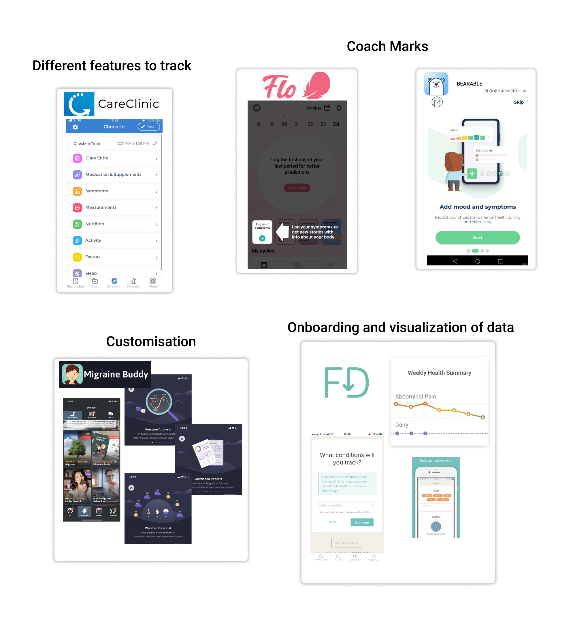
Conducted in-depth research - to check other medical tracking apps, through this we learned that most apps are overwhelming and often not relevant to the users medical condition.
Usability Testing
We decided diary studies would be a good way to see how users find interacting with EVA over a few days—and how data was visually fed back to them during this time. This was conducted with three users over a period of four days. Along with the diary studies we also went ahead with usability tests to see first hand how the users interact with the app currently. We did this with four users.
Insights from the initial test
Explore
Interviews
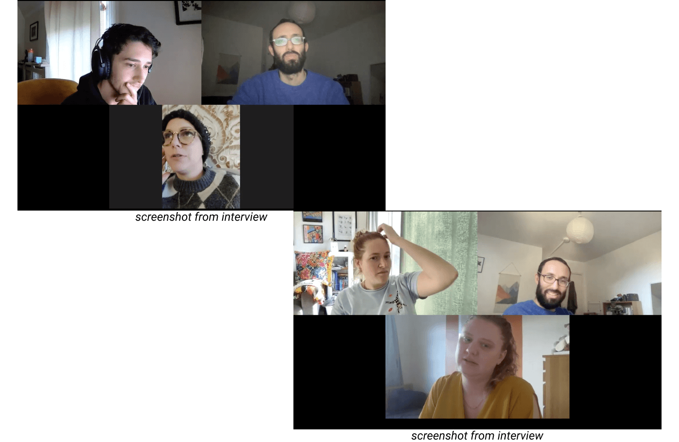
After deliberating with the team as to how to approach this and what questions to ask, we set up a survey as a way to gather information on tracking in general and filter through these to get our interviewees. We managed to get 9 interviews (7 people who monitor a health-related issue and 2 doctors) part-selected by our survey.
Persona
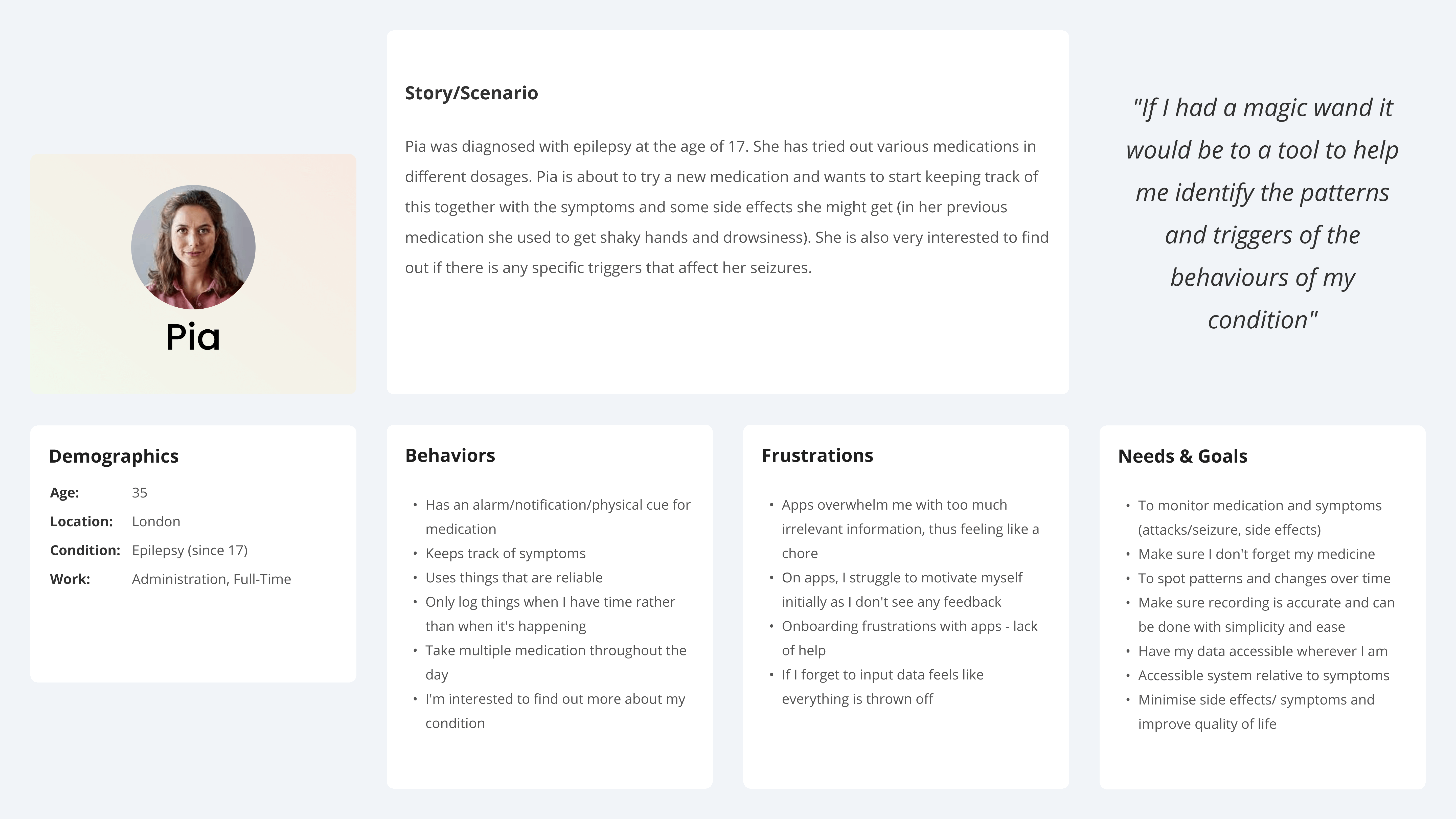
We gathered all our notes from the interviews and synthesised them in an affinity map, which very quickly led us to see trends that we incorporated in our primary persona Pia:
Our insights
Problem statement
“Pia needs an accessible, efficient and organised way to monitor her condition and new medication on one platform, including her symptoms, side effects and triggers, in order to predict and manage her health and wellbeing”
User Journey
We made a user journey to show the current experience Pia has. Here we can see the pain-points experienced so we know areas that need focusing on.
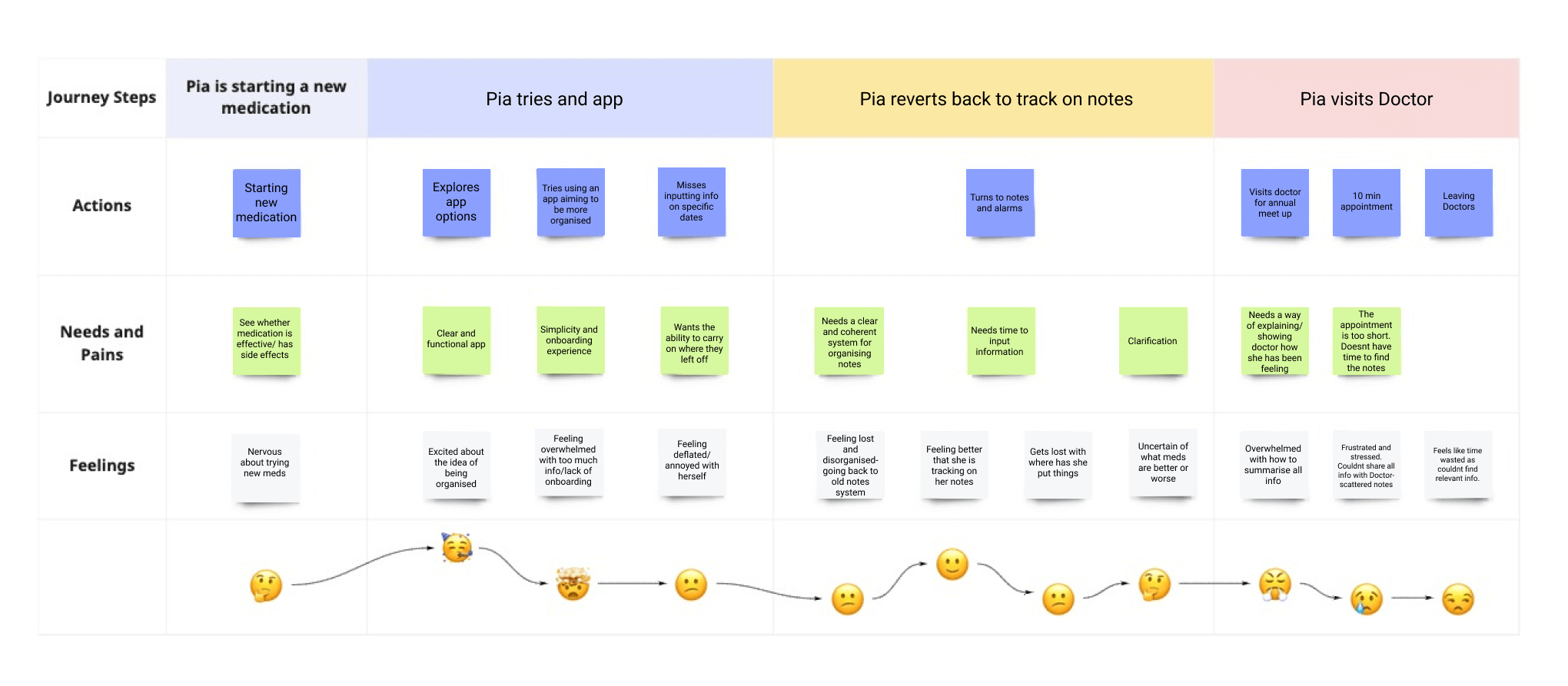
We chose these four HMWs as they correlate with our insights
How might we…
Develop
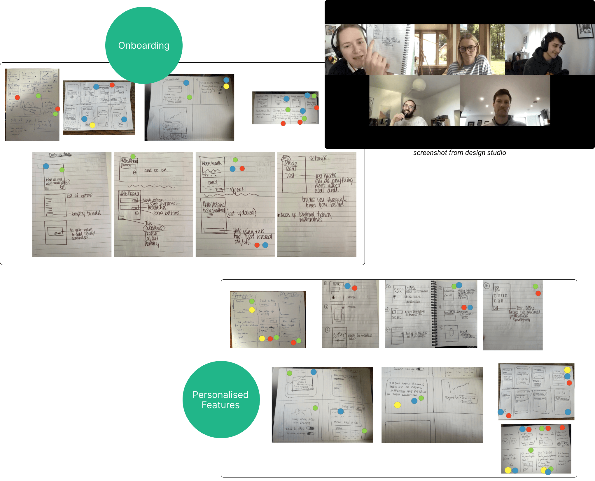
Design Studio
Using the chosen HMW’s and our problem statement we invited our client to join us in a design studio. We prioritised onboarding as the first round of the design studio, being an important part of the whole project and something we learned was needed by users when initially opening the app. In the second round we explored how we might personalise the experience for the user.
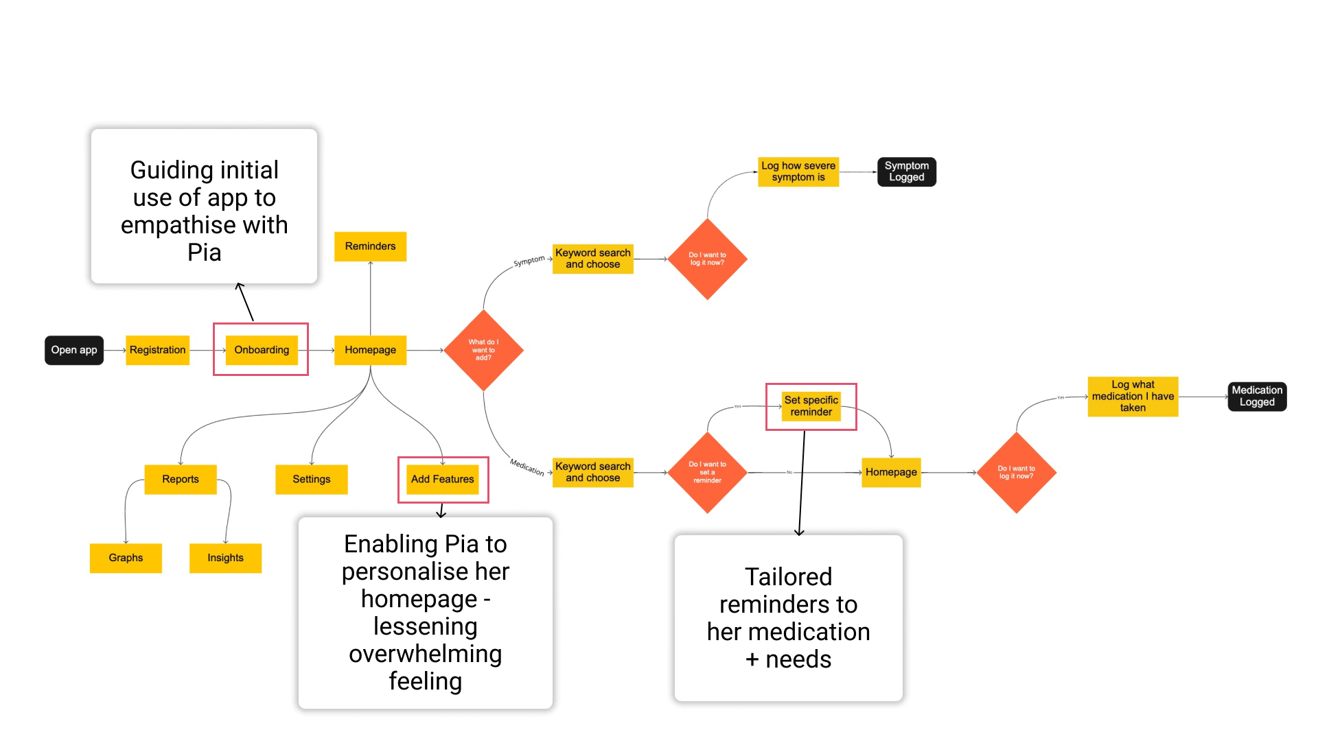
User Flow
We created a user flow that will show how the user will move through the app effectively.
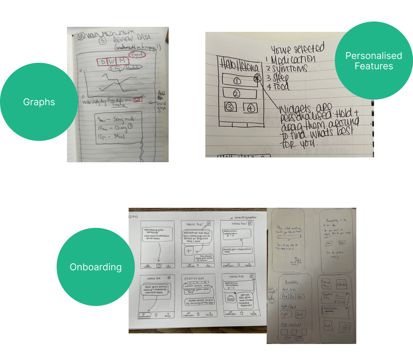
Sketches
The three areas highlighted in the flow were what we wanted to focus on, so we timeboxed ourselves and got down to sketching.
Low-Fidelity + Usability Test
We moved on from our sketches to create our low fidelity prototype on Figma. We conducted usability tests with 7 users.
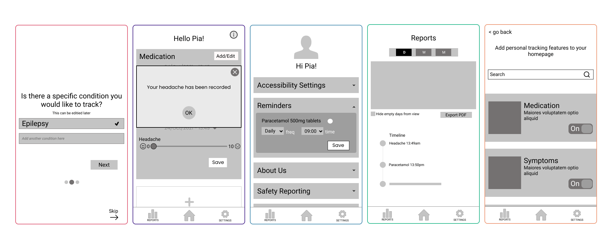
Test tasks
What testing told us
From this we found some great insights. Here are the results:
Deliver
High-Fidelity
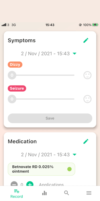
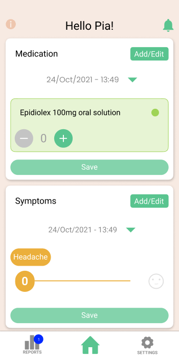
Due to users liking the colours and the general UI of Alta Flora which we learned in our initial testing of the app. We decided to only change what was needed. Below you can see that the design has altered but visually it’s similar.
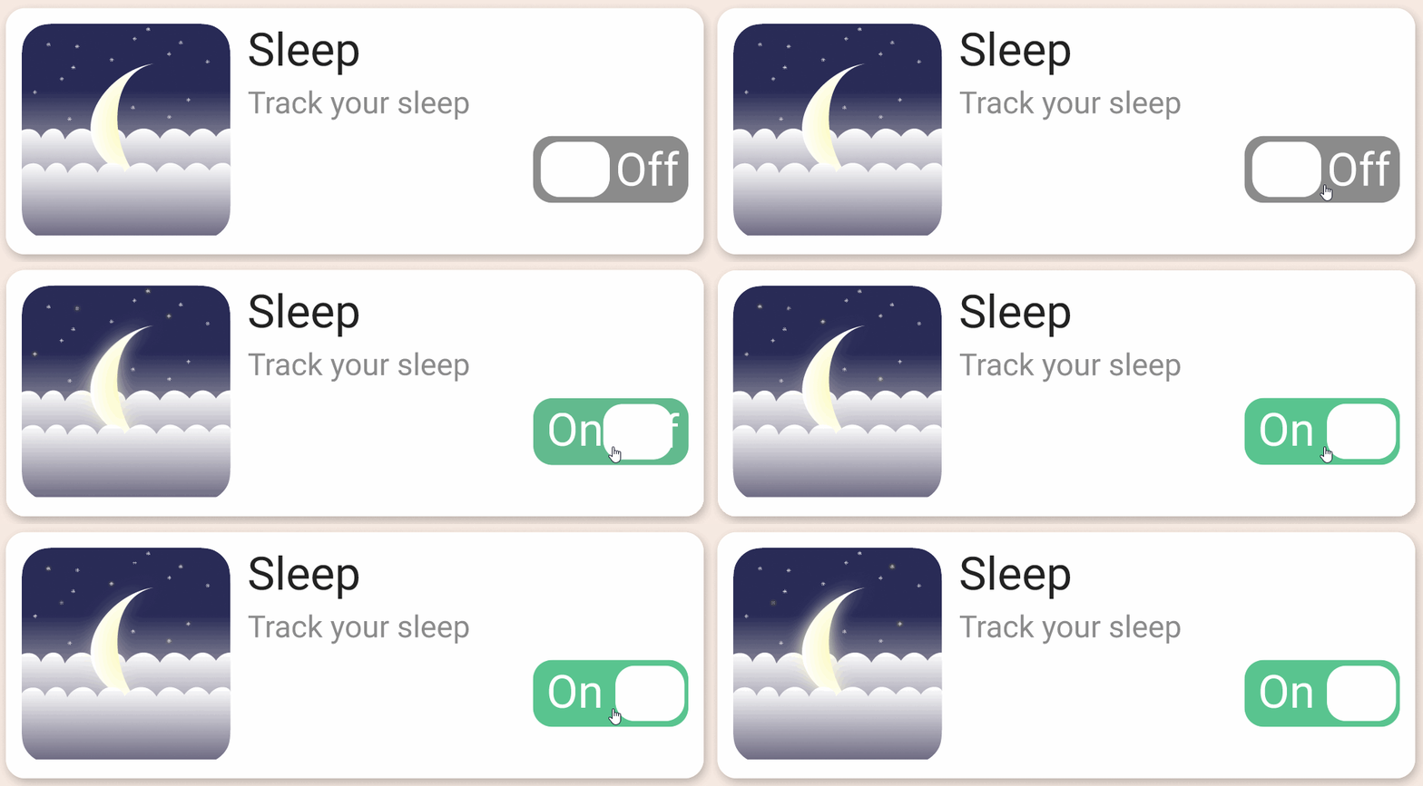
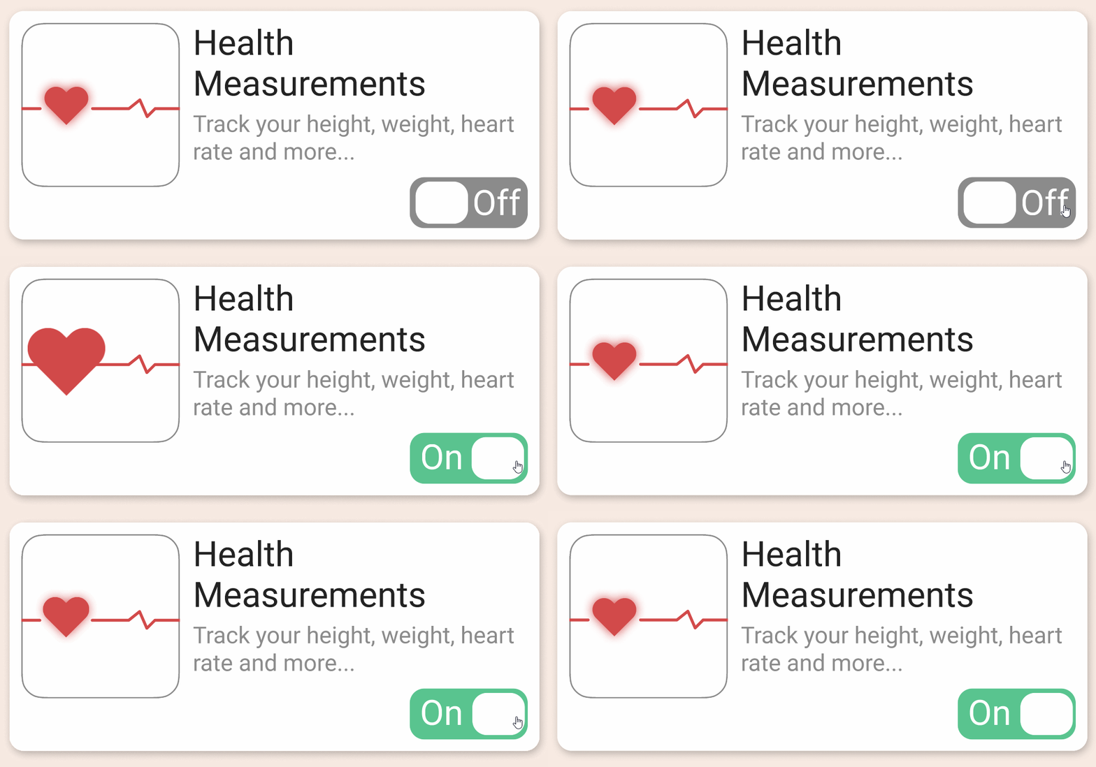
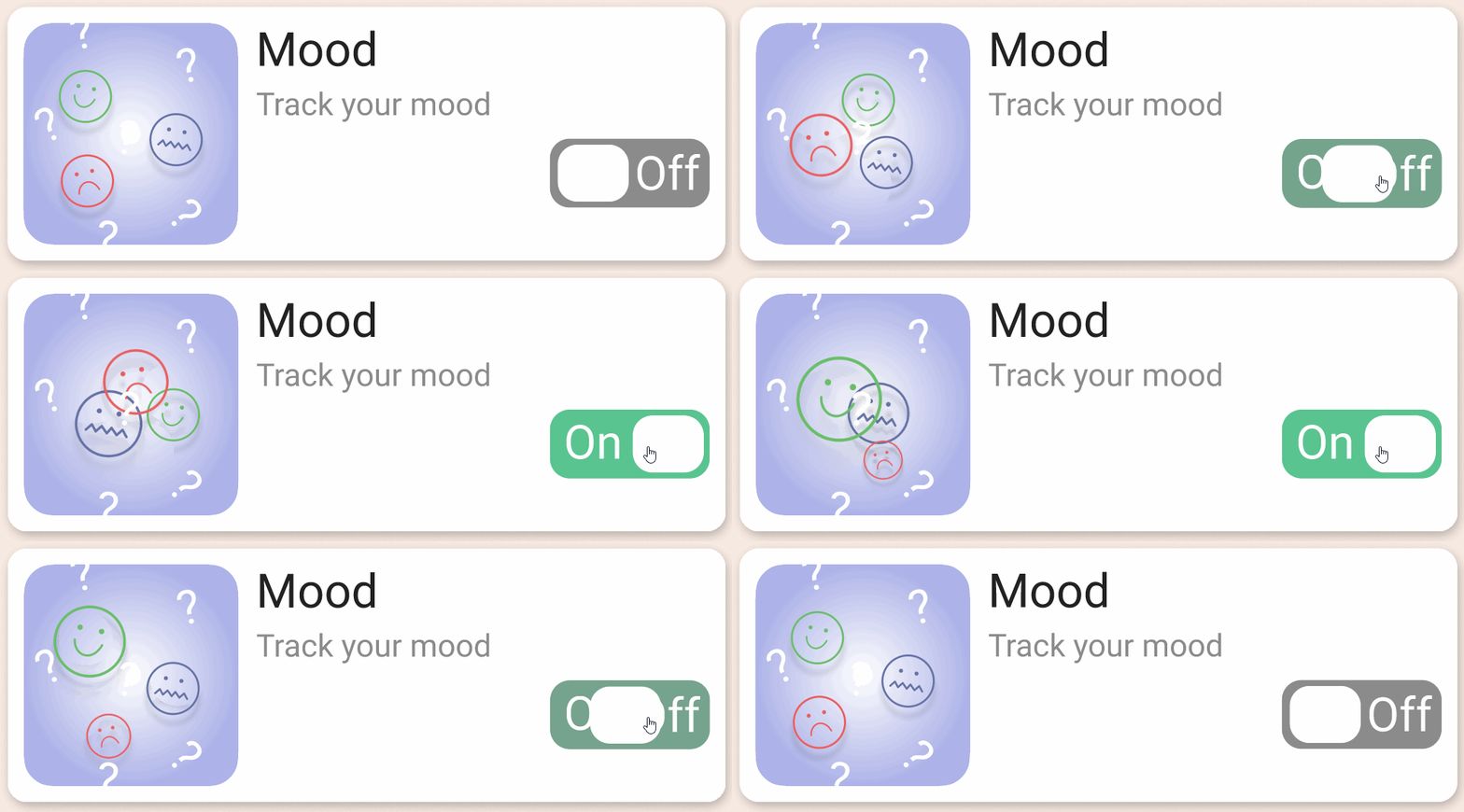
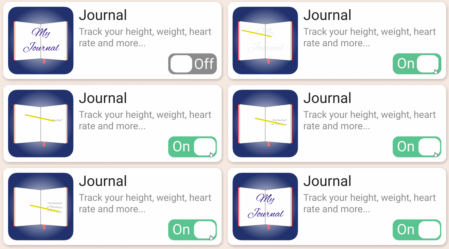
Custom icons + animation
While creating our prototype I asked my team member Scarlet (who is very artistic and talented at drawing) to create custom icons for our widgets to help personalise the app. As a big fan of animation and believing that interactions can really bring delight to users when going through an app I then animated these drawings using Figma.
High-Fidelity Testing
Nearing the end of this design sprint we wanted to test our prototype one last time before our presentation to the client. We tested the flows with 4 users.
“It’s all greyed out, can I use it?”
Coloured bar to fit symptom and made an active state for ‘Save’
“The drop down button looks like a tick, not an arrow.”
Changing it to a filled in arrow
“show more needs to be made more prominent”
Making it a more prominent button, and keeping consistency in the arrow shape.
Hitting The Brief
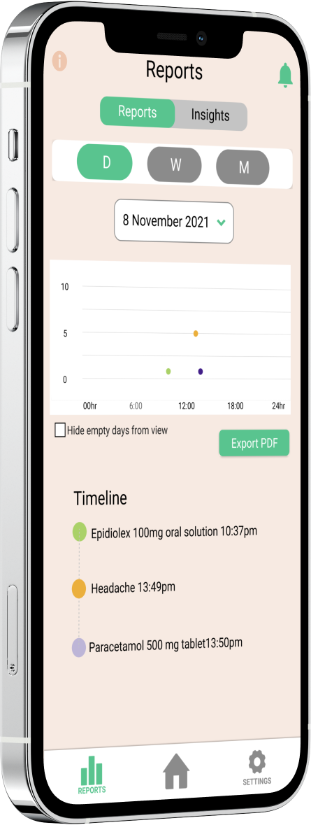
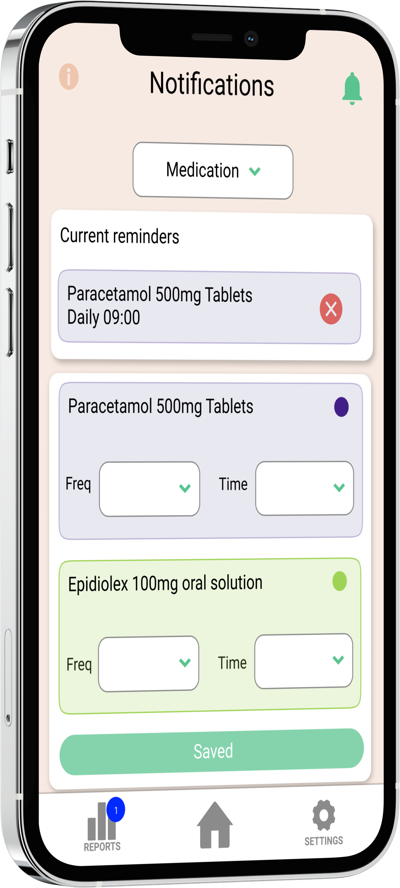
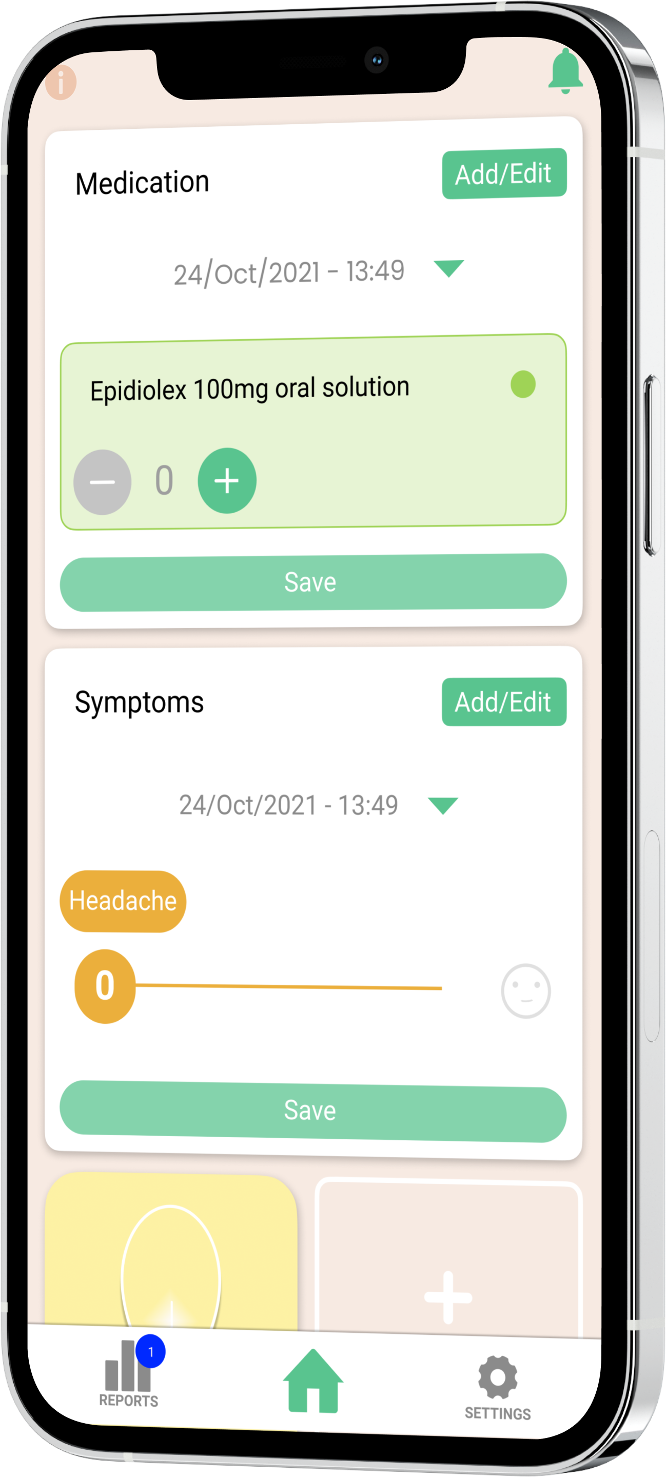
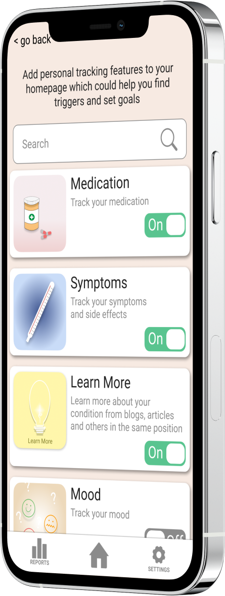
Our final prototype adds onboarding/coachmarks, improved UI, personalisation and further detailed information based on the input of the user. All things we learnt users needed during our research which also met the deliverables of Alta Flora.
Reflection
Learnings
Not only was this project interesting and rewarding I learned a lot throughout it. There were some tricky parts like getting the right people to interview and being able to make them feel at ease to open up about their condition and experiences. But overcoming this we learned key insights like how users wanted a more personal experience based on their condition.
“What tracking has given me is freedom and relief, so whatever tools can help identify the triggers and patterns for your symptoms - being able to look at what’s helpful and what’s not in your routine - is helpful”